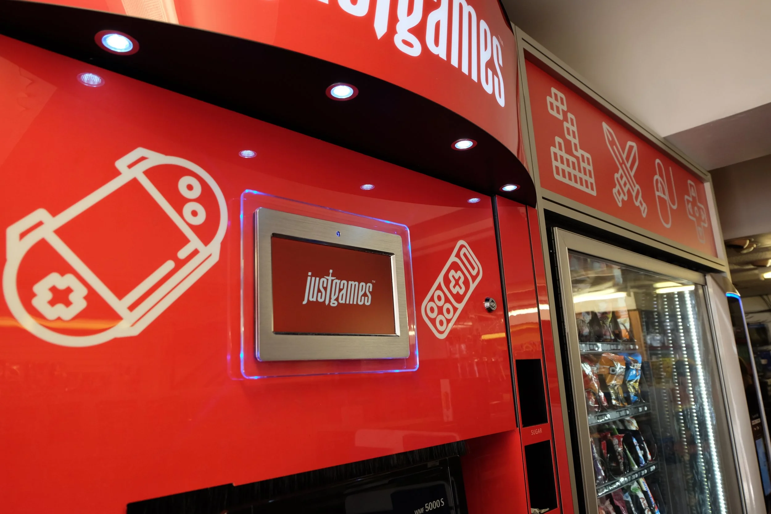
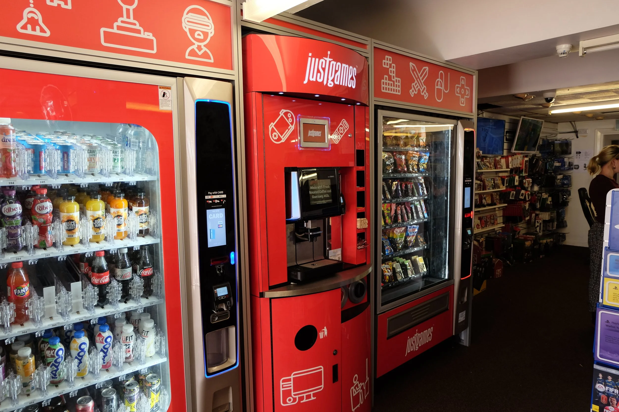
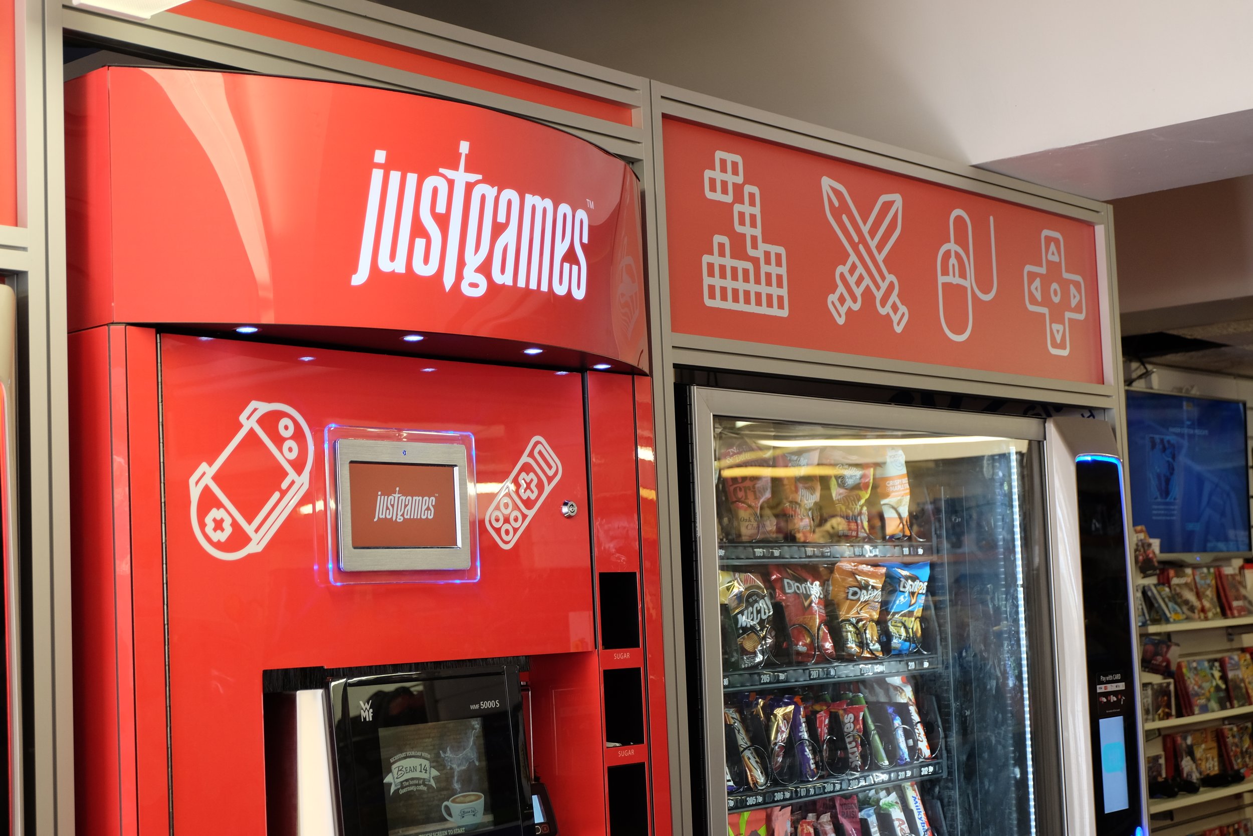
Branding for a video games store in Guernsey, C.I.
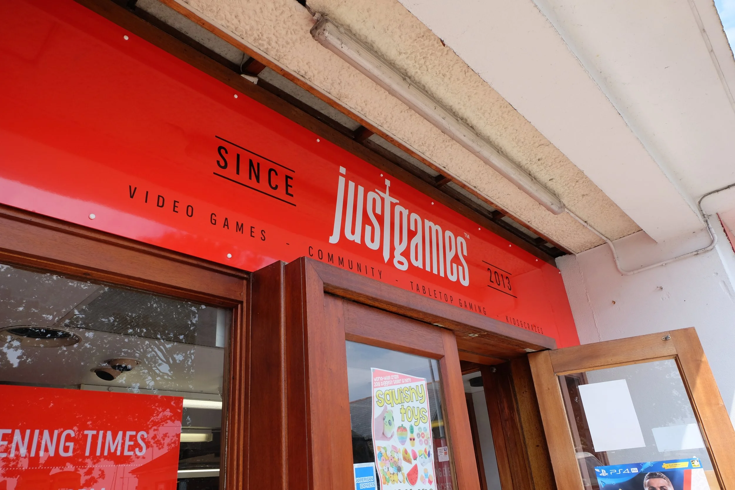
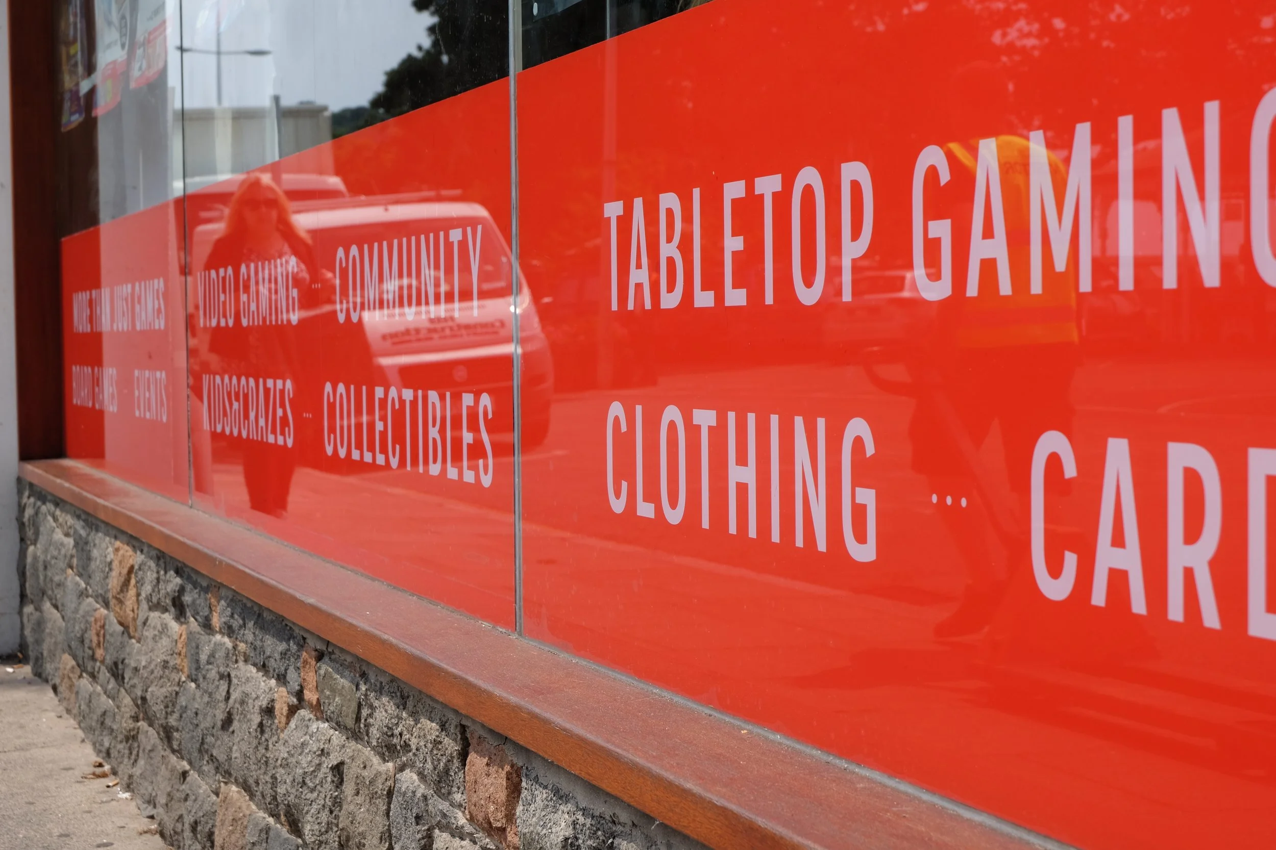
Just Games is an independent gaming store. I designed their original logo when it opened back in 2013 and always had an urge to go back and rebrand. In April 2018, they made the decision to relocate and I took the opportunity for a do-over, as well as the chance for my first solo shop fit. I wanted to create something simpler and more timeless, that could work across print and digital seamlessly. The original was very much modelled on retro video game fonts but the store has since evolved beyond that to include a large tabletop gaming community, squishies and trends store, Pokemon, magic cards, you name it. So the logo couldn't stay exclusive.
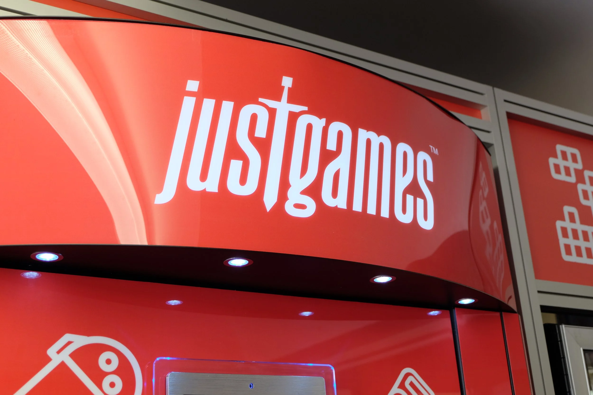
The italic typeface has instant energy about it, like it's running headlong into battle or being dragged along by a car. The sword used as a makeshift T is the carry through across all genres of gaming and it ties the whole thing together. It also gives the brand name a double meaning. Instead of selling 'just' games it now plays off the fact they are an independent retailer, looking out for the little guy like a knight would. To be just is to be righteous and fight with honour and valour. This also means that the icon of a knight can be used for future projects such as their own Just Games E-Sports team.